Amrutanjan (retailing in healthcare industry). Contemporarizing a 119-year-old brand. Re-launched in 2010.

CONTEXT
Amrutanjan is among the most recalled Indian brands across India. As India’s inventor of an external remedy for pain since 1893, it is a great household name. A reflection of its inventive capacity is how it has sustained decade after decade. The brand has traversed from British India to independent India 1947, through the “license raj” closed economy upto 1991 and beyond to the economic reforms. In the liberalized economy after 1991, a lot of brands were introduced in this category, so the category salience shot up. In this scenario, the brand needed rejuvenation. It had very good quality products and had introduced a new category of convenience segments. Management willingness to contemporarize the brand was very high. The nobility of the brand was that it was totally harmless for the body, and all its products were very efficacious.
PURPOSE
We were appointed in 2010 to rejuvenate the brand and make it more contemporary in the digital age while keeping intact Amrutanjan’s huge equity in the market.
OBJECTIVE
To revitalize the old brand, to tune it to the digital generation to help the brand achieve quantum growth and retain its leadership in the market. How to distinguish Amrutanjan brand with its distinctive application benefit as well as absorb its different new convenience products under the same brand?
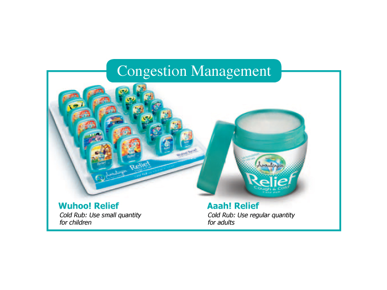
STRATEGIC EXECUTION
The voice of their customers always upheld the purity of Amrutanjan’s products. We translated that as “Pure Healthy Essence” in the brand repositioning platform by blending science with nature. It was very important to keep the inception of Amrutanjan since 1893 in the rejuvenated brand for its acclaimed equity in the market. In this domain, a lot of companies came and went, but Amrutanjan remained in the industry. So to authenticate the long history of the brand’s worth in the competitive environment, it was critical to display the brand’s birth date. We designed a new script typography of Amrutanjan that portrays the product character as easy and fluid in the body. The brand in a round sphere gives the dimension of nature and science in a harmonious planet.
“Kick out pain” communication isolated from Amrutanjan brand was designed to make the pain category specific to denote the functional benefit of the category.
For congestion relief, we created the Relief suffix brand governed by Amrutanjan brand. So the suffix brand Relief plays a huge role as the benefit from congestion. A totally different colour code and new structural packaging for the cough and cold category were designed for Relief.
We created a strong brand architecture with the power of Amrutanjan brand while giving enormous liberty for line extensions and category extensions. The renovation launch was done in 2011. Amrutanjan is an example of rejuvenating a very old brand and diversifying from one category to others and re-establishing its new edge for the digital generation while retaining the brand’s inventive authority in India..